Forms
Build custom forms for lead capture, event registrations, surveys, and payments with a Paperform-style live editor. Submissions flow directly into your CRM.
Overview
Forms in Modality are more than simple data collectors — they are a core CRM integration point. Every form submission can create or update a person record, apply tags, add to lists, and trigger automations. Forms support a wide variety of field types, conditional logic, multi-page layouts, payment collection via Stripe, and custom theming.
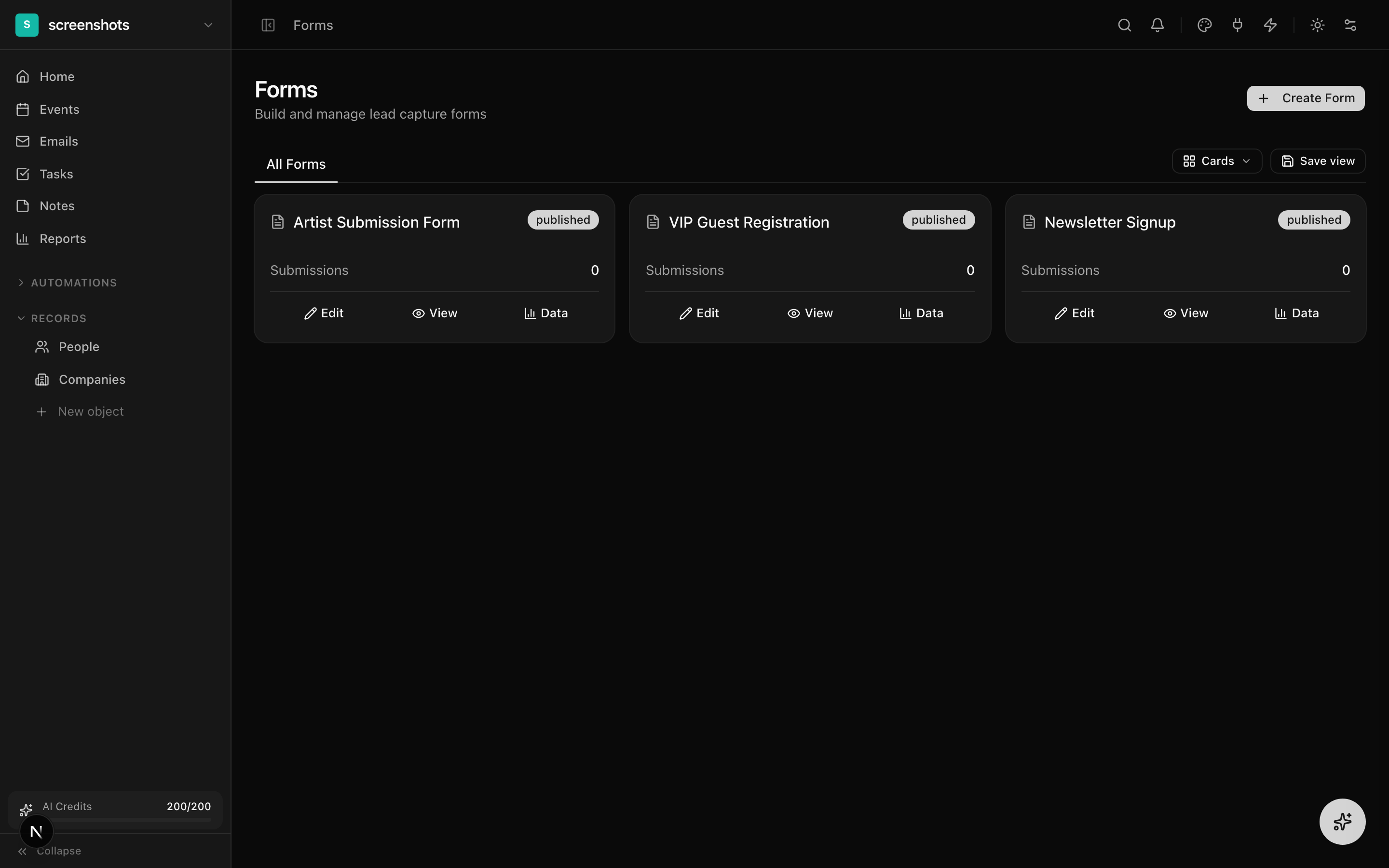
The Forms page lists all forms in your workspace with their submission count, status (draft or published), and creation date. Click any form to open the live builder.
The Live Form Builder
The form builder uses a Paperform-style "what you see is what you get" editing approach. Instead of a separate editor and preview, the actual form is the editing surface. You click directly on labels, helper text, placeholder text, and option values to edit them inline.
How to Build a Form
- 1
Create a new form
Navigate to Forms in the sidebar and click "New Form." Enter a name (e.g., "Event Registration") and click Create. The live builder opens immediately.
- 2
Add fields from the palette
The field palette appears on the left side. Click a field type to add it to the form, or drag it to a specific position. Available field types include: short text, long text, email, phone, number, date, select, multi-select, radio, checkbox, file upload, rating, and more.
- 3
Edit fields inline
Click directly on a field's label text to rename it. Click the helper text area below the field to add a description. For select/radio fields, click option values to rename them, or click the "+" button to add more options.
- 4
Reorder fields
Drag any field by its handle (the grip dots on the left edge) to reorder it. A blue insertion line shows where the field will land. Release to drop it in the new position.
- 5
Configure field settings
Click the gear icon on any field (or select the field and look at the right panel) to access advanced settings: required toggle, validation rules, placeholder text, default values, and conditional visibility.
Adding and Configuring Fields
Field Types
The field palette is organized into categories:
- Text inputs — short text, long text (textarea), rich text
- Contact fields — first name, last name, email, phone (auto-mapped to CRM)
- Choice fields — select dropdown, radio buttons, checkbox group, multi-select
- Data fields — number, date, time, currency, URL, rating
- Layout — heading, paragraph (static text), divider, page break
- Special — file upload, hidden field, product (Stripe payment)
Field Validation
Each field can be configured with validation rules in the settings panel:
- Required — toggle to make the field mandatory
- Min/Max length — for text fields, set character limits
- Min/Max value — for number fields, set value bounds
- Pattern — regex validation for custom formats
- Custom error message — override the default validation message
Conditional Field Visibility
Show or hide fields dynamically based on answers to other fields. This lets you create branching forms that adapt to the respondent's input.
How to Set Up Conditions
- Select the field you want to show or hide conditionally.
- Open the field settings panel and navigate to the "Conditions" tab.
- Click "Add Condition." Select the source field (the field whose answer determines visibility).
- Choose an operator: equals, not equals, contains, is not empty, or is empty.
- For select and radio fields, an option picker appears so you can choose the specific value to match.
- Add multiple conditions and choose whether ALL (AND) or ANY (OR) must be met.
- The condition evaluates in real-time — the field shows or hides instantly in both the builder preview and the published form.
Contact Field Mapping
Form submissions can automatically create or update person records in your CRM. This is powered by field mapping — linking form fields to CRM columns.
How Mapping Works
- Drag a "Contact field" (First Name, Last Name, Email, Phone) from the palette onto your form. These fields are pre-mapped to the corresponding CRM columns.
- For custom fields, open the field settings and select the CRM field to map to from the "Contact mapping" dropdown.
- When a form is submitted, Modality checks for an existing person with the same email address. If found, the person is updated. If not, a new person is created.
- Tags and list memberships can be automatically applied to the created/updated person via the form's "On Submit" settings.
Theming and Multi-Page Forms
Visual Theming
Customize the look of your form from the Theme tab in the builder:
- Background color — solid color or gradient
- Font family — choose from your brand kit fonts or system fonts
- Button style — color, border radius, text
- Field style — border color, focus ring color, label alignment
- Logo — display your workspace logo at the top of the form
Forms automatically support dark mode. When a visitor's system is set to dark mode, the form renders with inverted colors.
Multi-Page Forms
Break long forms into multiple pages for a better user experience:
- Drag a "Page Break" element from the palette to create a new page.
- Page tabs appear at the top of the builder. Click tabs to switch between pages.
- Rename pages by clicking the tab label.
- On the published form, respondents see Next/Previous buttons to navigate between pages.
- A progress indicator shows which page the respondent is on.
Keyboard Shortcuts
The form builder supports keyboard shortcuts for efficient editing:
- Ctrl/Cmd + Z — undo the last change
- Ctrl/Cmd + Shift + Z — redo the last undone change
- Backspace / Delete — delete the currently selected field
- Escape — deselect the current field
- Arrow Up / Arrow Down — move selection between fields
The undo/redo history tracks all changes: field additions, deletions, reorders, label edits, setting changes, and condition updates. History is preserved for the duration of the builder session.
Publishing and Embedding
Publishing a Form
- When your form is ready, click the "Publish" button in the top-right corner of the builder.
- The form status changes from Draft to Published.
- A public URL is generated at
/f/your-form-slug. Share this URL directly or embed it. - Published forms can still be edited. Changes are saved automatically and reflected on the public page immediately.
- To unpublish, click the status badge and select "Unpublish." The public page will show a "form unavailable" message.
Embedding on External Sites
Click the "Share" button to access embed options:
- Direct link — copy the public URL for sharing via email, social media, or messaging
- JavaScript embed — copy a snippet to embed the form on any website. The form renders in an iframe with automatic height adjustment.
- QR code — download a QR code that links to the form, useful for print materials and event signage